Kite theme documentation
Kite Theme Documentation
Welcome to the Kite Ghost theme by Iris Themes. Kite is a link-in-bio Ghost theme with sections for quick links, guest appearances, a shop, life updates, and work inquiries, plus a full blog with memberships and newsletter signup built in.
The homepage uses an alternating rhythm — open sections on the cream, boxed white cards, and full-width dark / accent bands — so it reads as a designed page rather than a stack of identical boxes.
If you run into any issue or have an idea for a feature you'd like to see, contact us at [email protected] — all future updates are included with your purchase.
Theme info
- Current version: 1.1.0
- Compatible with: Ghost 5.0 and newer (tested on Ghost 6)
- Editor support: all Koenig cards styled — callout, bookmark, toggle, gallery, file, product, header, button, audio, video, and embeds
Installation
- In Ghost Admin, go to Settings → Design & branding → Change theme.
- Click Upload theme and select
kite.zip. - Activate the theme.
Kite ships with its own routes.yaml, which current Ghost versions apply automatically when the theme is activated. If your homepage doesn't show the bio landing after activation, apply the routes manually: unzip the theme, then go to Settings → Labs → Routes and upload the routes.yaml file from the theme folder.
Once the routes are applied, your site structure is:
/— Bio landing page (hero + homepage sections)/latest/— The full paginated post list/your-post-slug/— Individual posts/tag/…/and/author/…/— Tag and author archives
Home page setup
The homepage is assembled from your site branding plus a set of optional sections. Most sections pull their content from a regular Ghost page, matched by slug — create the page, add content, and the section appears automatically. No page, no section: everything is optional.
The sections, in order down the page:
- Hero — borderless — Publication branding + hero settings
- Quick links + signup — boxed white card — Page slug
links(+ Portal signup) - Guest appearances — full-width dark band — Posts tagged
#appearance - Closet / shop — boxed white card — Page slug
closet - Life lately — open ruled list — Page slug
life-lately - From the blog — boxed white card — Your latest posts (automatic)
- Work with me — open cards — Page slug
work-with-me - Newsletter closer — full-width accent band — Portal signup
For page-based sections, the page title becomes the section heading and the custom excerpt (page settings sidebar → Excerpt) becomes the subtitle. The appearances, closet, life-lately, and work sections each also have a show/hide toggle in the theme settings.
Hero
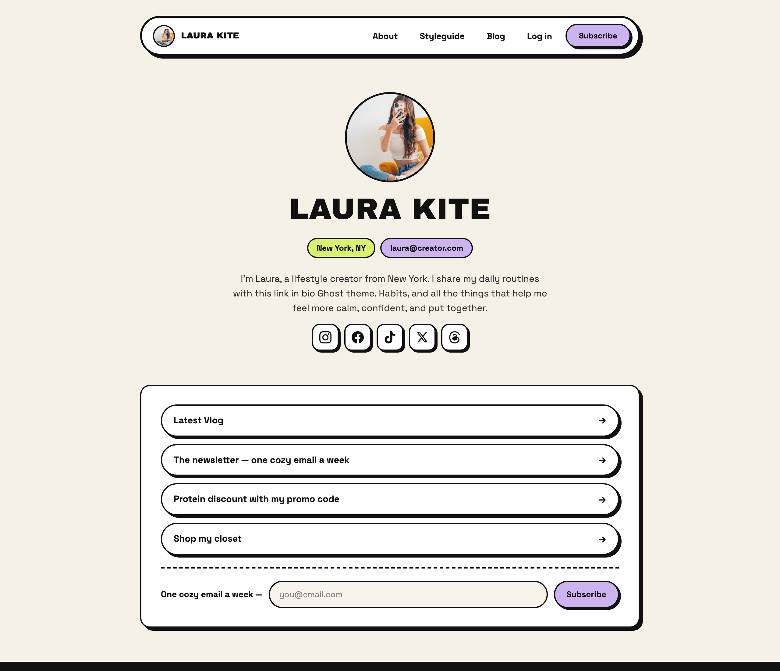
The hero at the top of the homepage is borderless — it breathes on the background rather than sitting in a box. It's built from your publication settings:
- Avatar — your publication logo (Settings → Design & branding → Publication logo); hidden when no logo is set
- Name — the site title
- Bio text — the Hero bio theme setting; if you leave it empty, your site description is used
- Location and contact pills — the Location and Contact email theme settings (each is hidden when empty)
- Social icons — see Social accounts below
Quick links + newsletter signup
Create a page with the slug links. Use product cards, bookmark cards, or header cards — each becomes a link row. Images are optional on link rows.
When members are enabled, a slim inline subscribe row appears at the bottom of this same box, below a dashed divider — so the links and the newsletter signup share one card instead of two stacked boxes.
Guest appearances
The appearances band pulls from your posts, not a page. Tag any post with the internal tag #appearance (post settings sidebar → Tags) and Kite lists the three most recent in a full-width dark band:
- Show name — the post's primary public tag (add a tag like "Kite & Coffee")
- Title — the post title
- Meta — the post date and reading time
- Artwork — the post's feature image
The section hides itself when no #appearance posts exist. Two theme settings control it: Show appearances turns it on/off, and Appearances dark band switches between the dark band and a plain boxed card. You can also override the heading and intro line with the Appearances heading / Appearances blurb settings.
Closet / shop
Create a page with the slug closet and add product cards:
- Title — the product name
- Description — brand and price (an extra line becomes a badge)
- Button — the shop link
Life lately
Create a page with the slug life-lately and add product cards:
- Image — the photo
- Title — the headline
- Description — a short blurb
- Button — an optional link
Work with me
Create a page with the slug work-with-me and add product cards — each becomes a contact card with a heading (title), blurb (description), and a call-to-action button.
Hiding section pages from search engines
The homepage embeds these pages' content, so the standalone pages (/links/, /closet/, and so on) don't need to be discovered separately. Add the internal tag #no-index to each section page (page settings sidebar → Tags) and Kite will add a noindex meta tag to that page. Internal tags are never visible to your visitors, and the tag works on any page or post — including the posts you tag #appearance.
Newsletter sections
When members are enabled, the homepage has exactly two signup points: the inline subscribe row inside the quick-links box, and a full-width accent newsletter closer band at the very bottom. The closer's subtitle comes from the Newsletter blurb theme setting, with a sensible default when empty. See Members & newsletter.
From the blog
The homepage automatically shows your latest posts in a boxed card: one large featured post (image, tag pill, title, reading time) beside up to three compact rows, with a view all posts link to /latest/. This section is always on — it needs no setup.
Theme settings
All Kite options live in Settings → Design & branding → Customize → Theme:
- Theme style — the whole look of the site from one dropdown (see Theme styles)
- Secondary color — accent for pills, contact cards, and highlights
- Location — pill in the homepage hero; empty to hide
- Hero bio — intro under your name; falls back to the site description
- Contact email — mailto pill in the hero; empty to hide
- Handle — your @handle, shown in the footer; empty to hide
- Newsletter blurb — subtitle for the newsletter signup sections
- Show appearances — show/hide the guest appearances band (needs
#appearanceposts) - Appearances dark band — dark band (on) vs. plain boxed card (off)
- Appearances heading / blurb — override the appearances section copy
- Show closet / Show life / Show work — show/hide those homepage sections
- Show search — adds a search button to the navigation
- Tier buttons open Portal — on: membership tier buttons open Ghost Portal checkout; off: they link to your
/membership/page instead - Default billing period — whether the membership page shows monthly or yearly prices first
- Spotify / Tumblr / Pinterest URL — extra social icons beyond Ghost's built-in accounts
Theme styles
Kite ships 11 complete visual styles. Switching styles changes colors, typography, shadows, and corner rounding across the entire site:
neobrutalist(default) — Raw borders, hard offset shadows, loud colorsswiss— Strict grids, grayscale, Helveticamidnight— A deep, calm dark modebubblegum— Pink, round, and playfuleditorial— Serif headlines on warm creamretro-os— Beveled system chrome on a teal desktopbitmap— 1-bit dither patterns and pixel-hard shadowsglass— Frosted, translucent panels over a colored glowminimal— Flat white cards, hairlines, one loud accentarcade— 8-bit platformers — coin blocks and pixel typeaqua— Pinstripes, traffic lights, glossy gel buttons
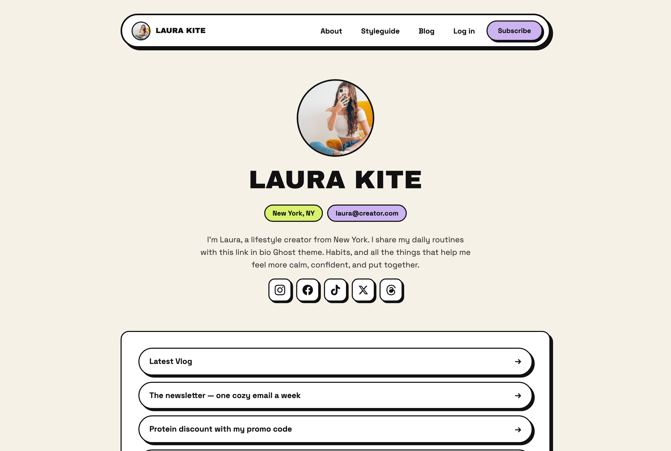
neobrutalistDefault — raw borders, hard offset shadows, loud colors
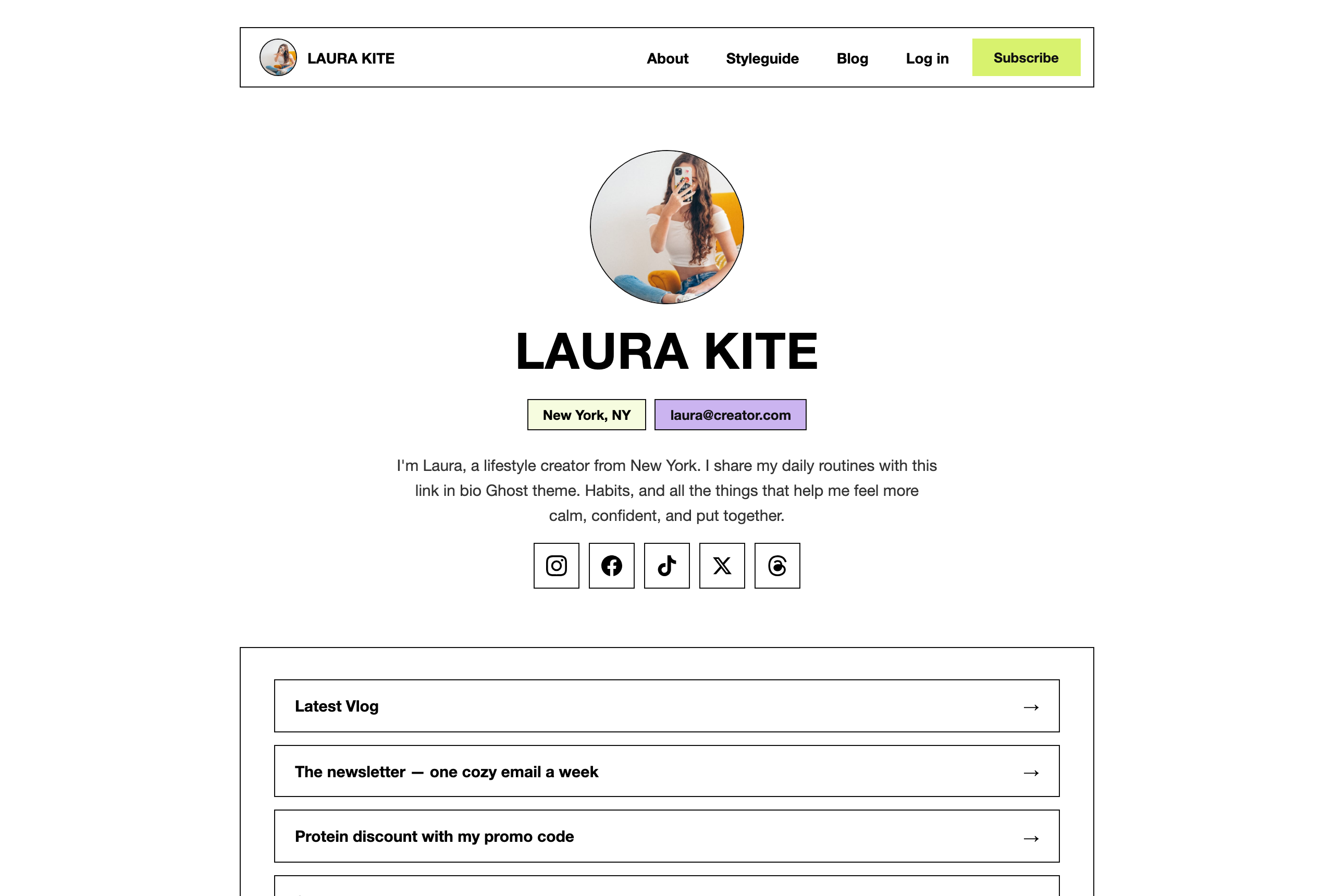
swissStrict grids, grayscale, Helvetica
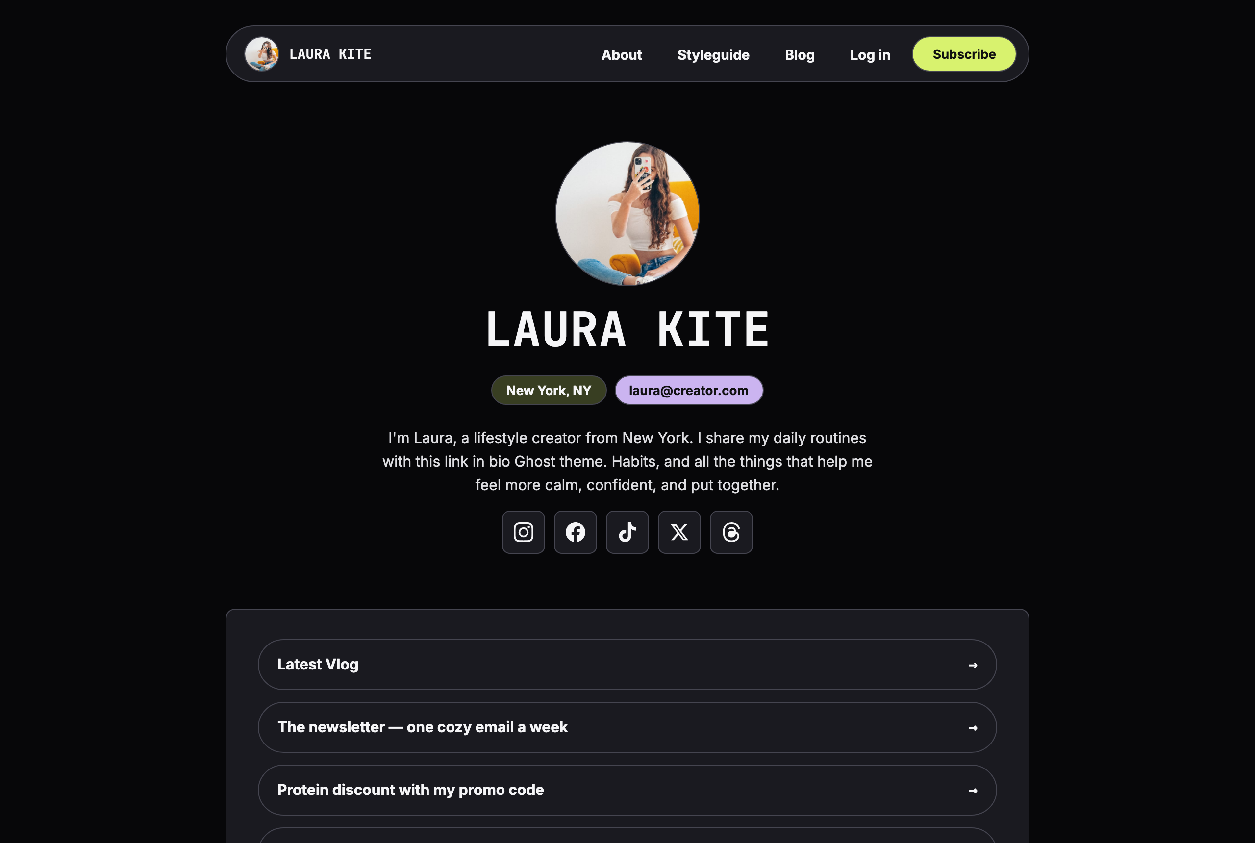
midnightA deep, calm dark mode
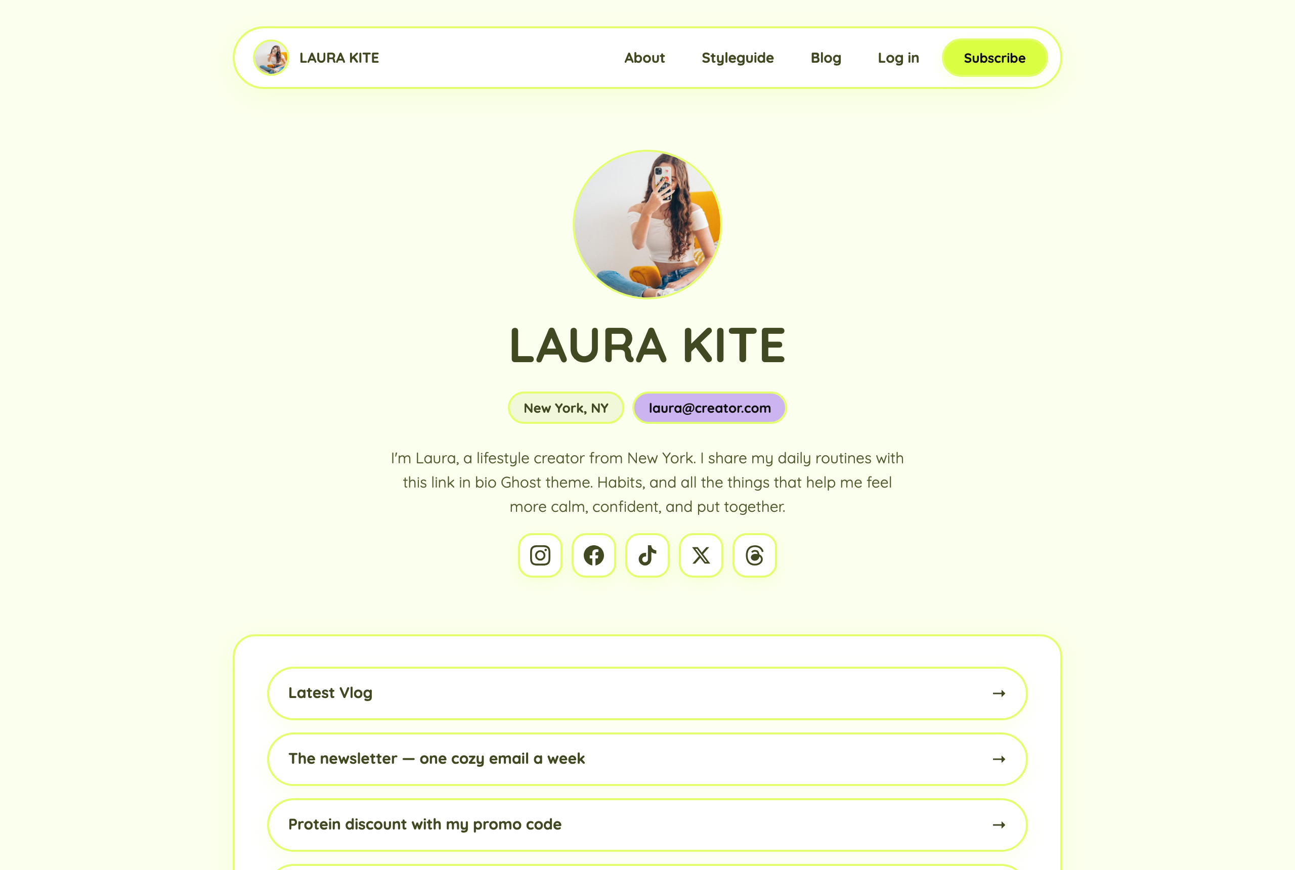
bubblegumPink, round, and playful
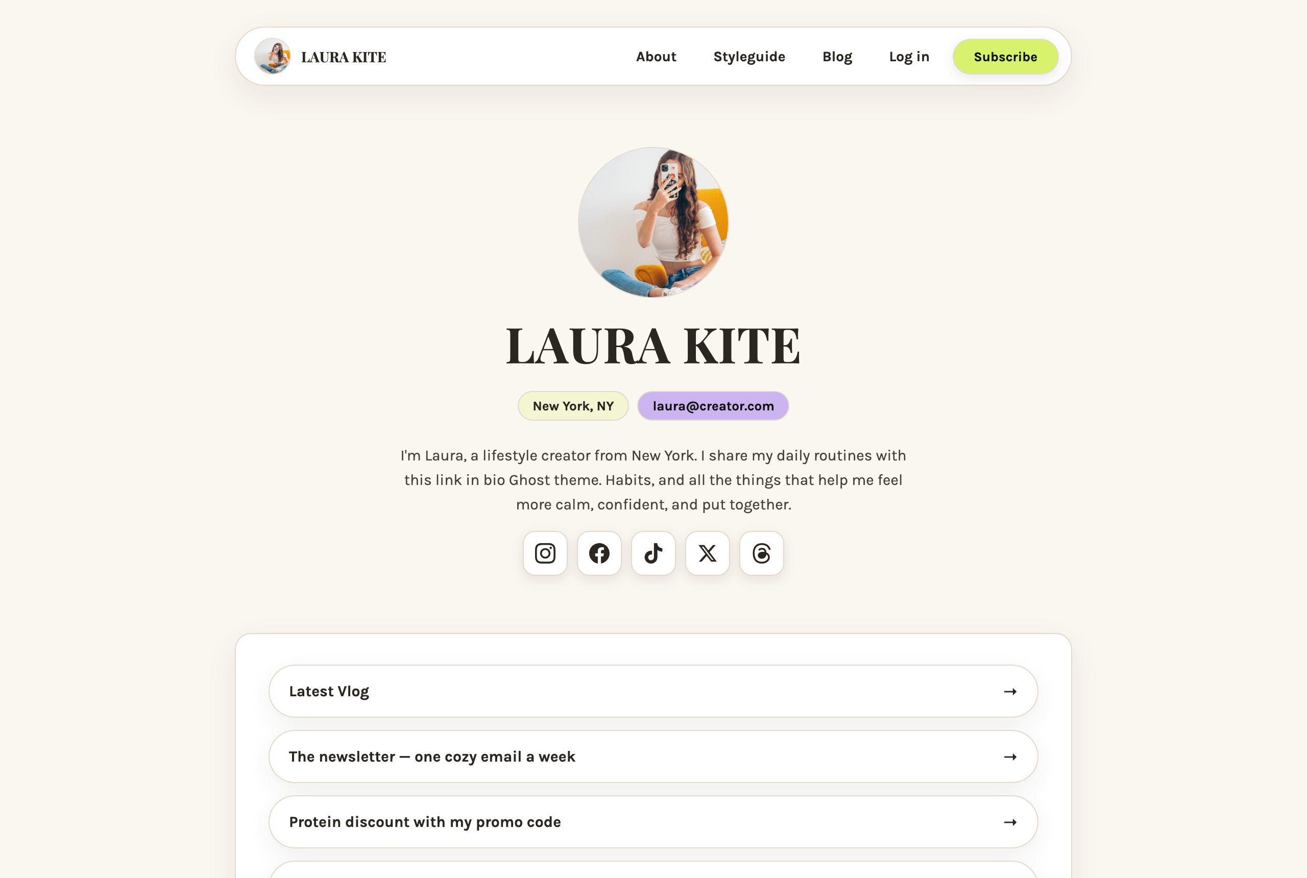
editorialSerif headlines on warm cream
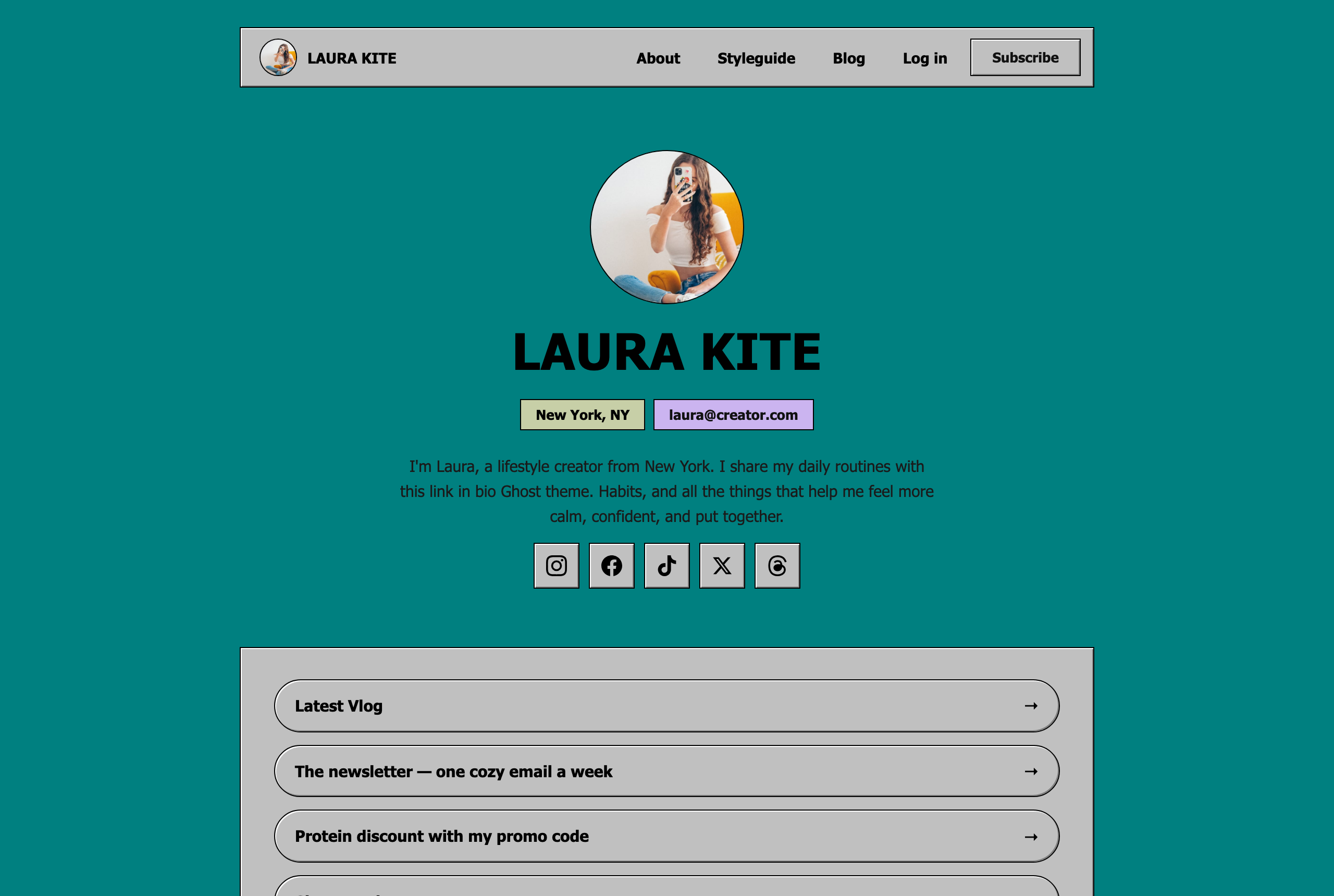
retro-osBeveled system chrome on a teal desktop
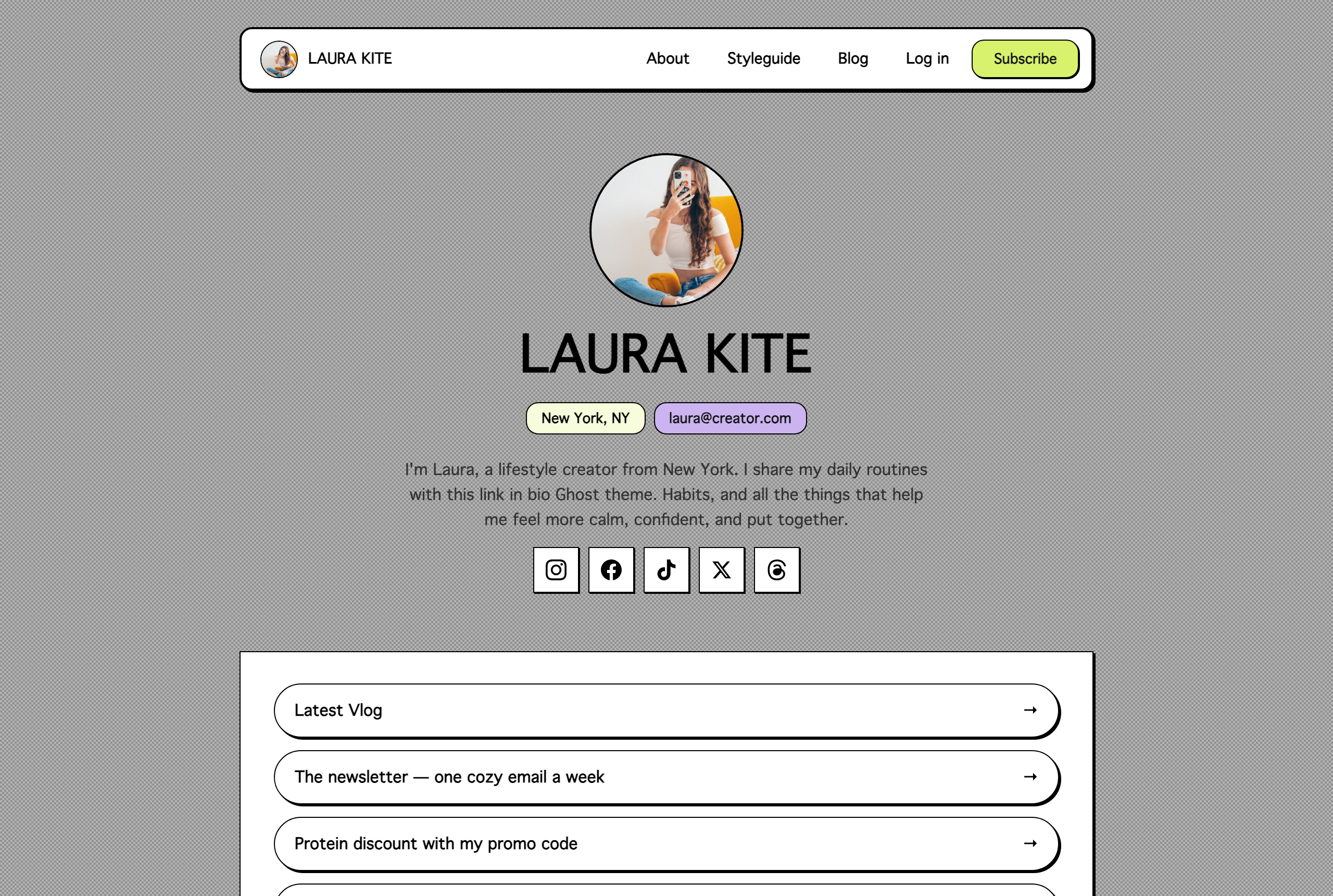
bitmap1-bit dither patterns and pixel-hard shadows
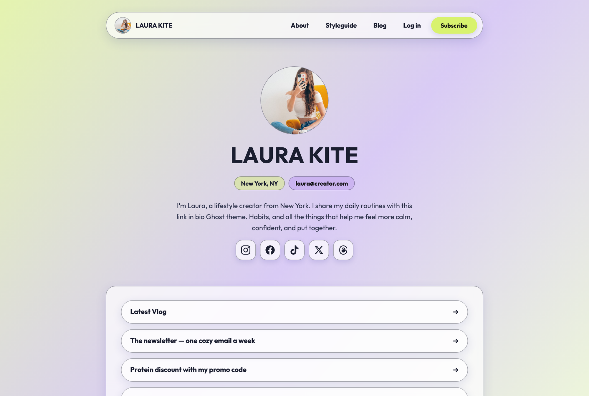
glassFrosted, translucent panels over a colored glow
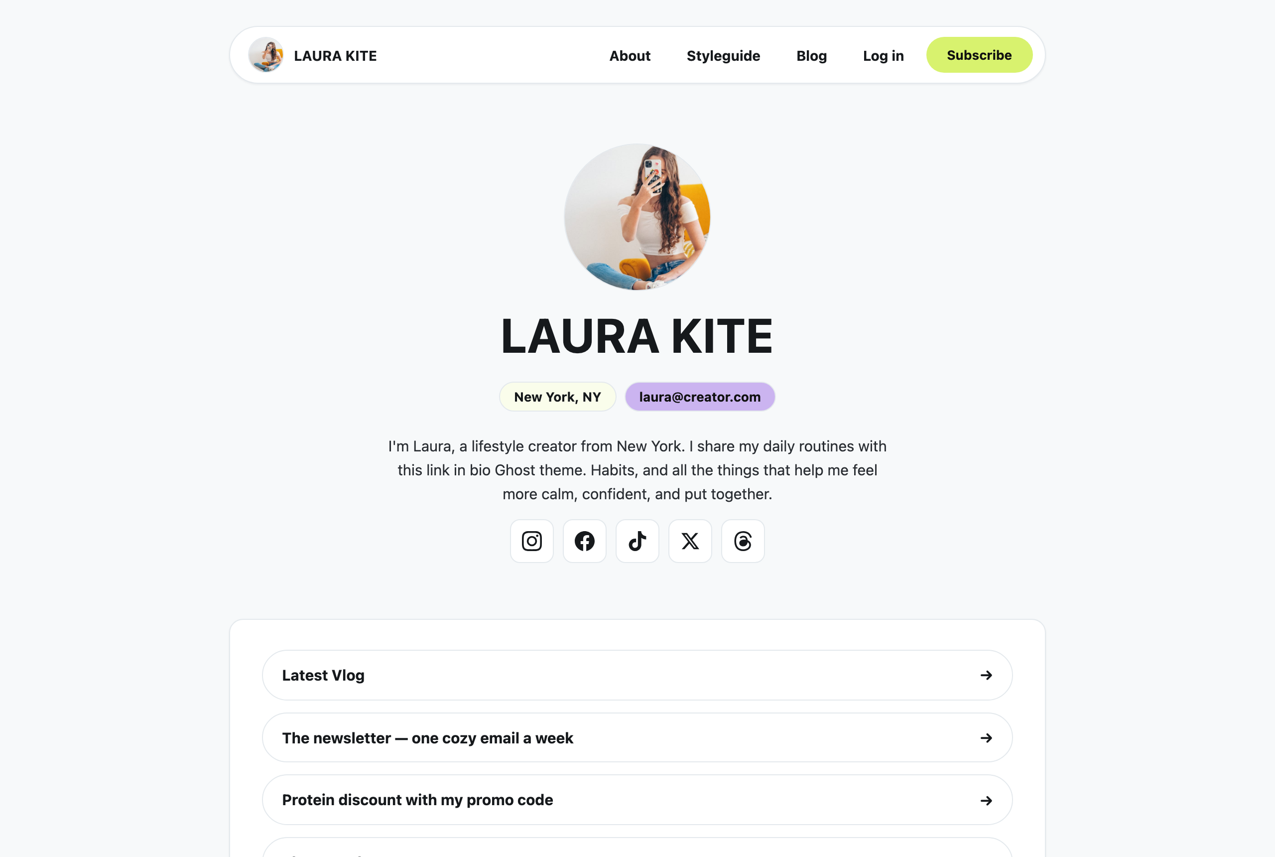
minimalFlat white cards, hairlines, one loud accent
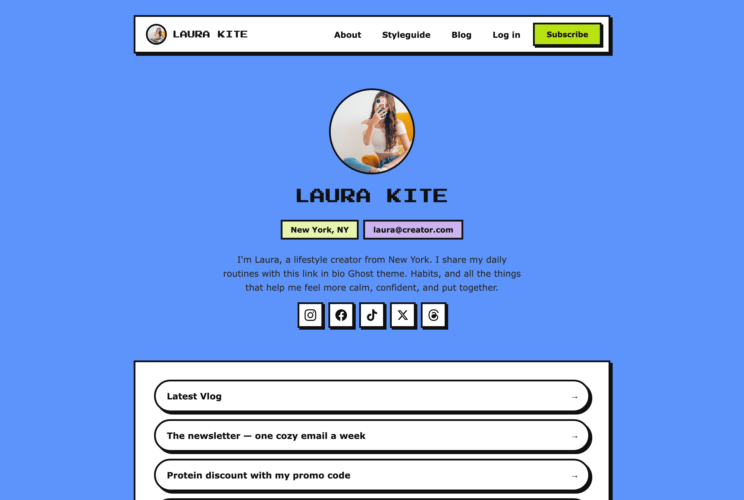
arcade8-bit platformers — coin blocks and pixel type
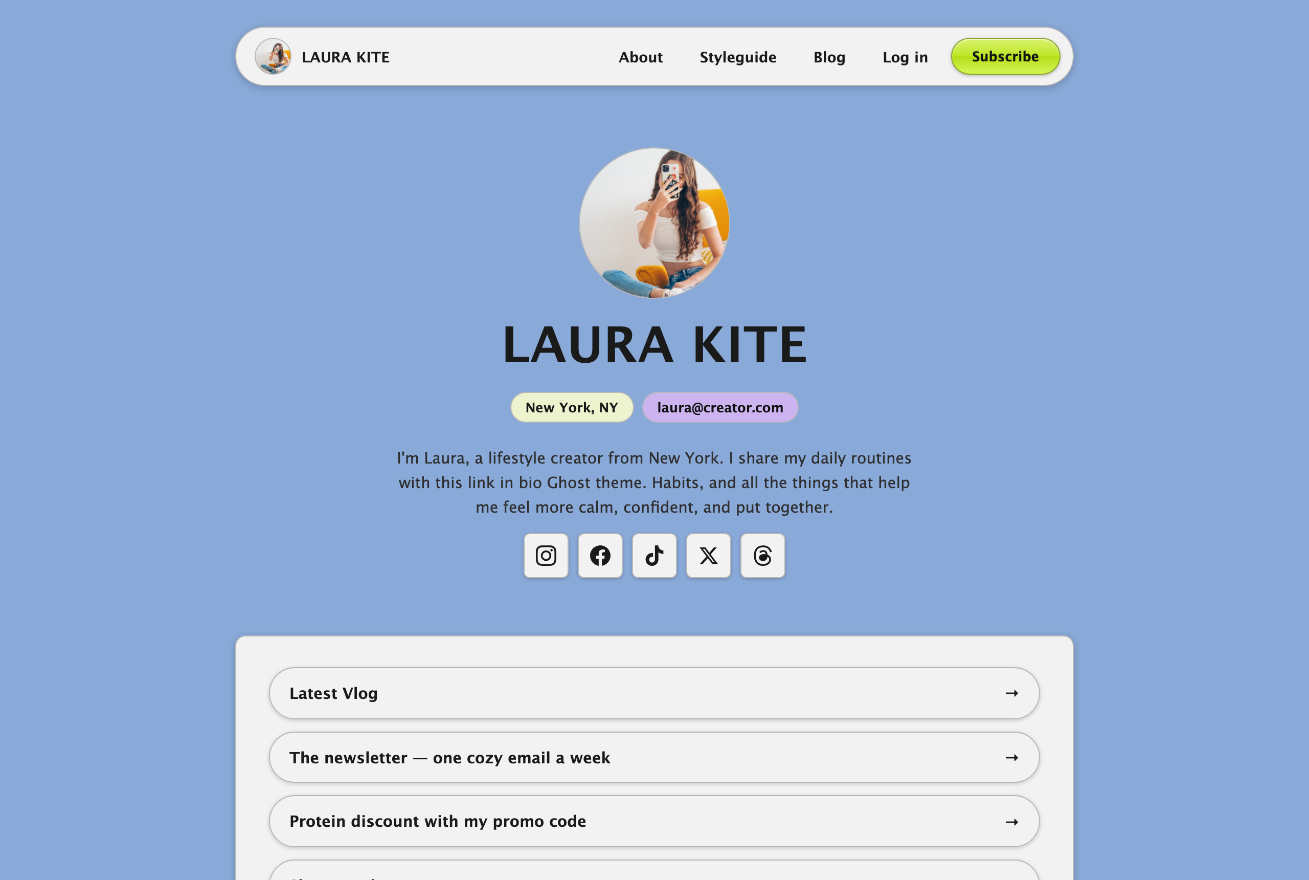
aquaPinstripes, traffic lights, glossy gel buttons
Every style follows your brand colors: the primary color comes from Settings → Design & branding → Brand color, and the secondary from the Secondary color theme setting. Styles remix these into their own palettes, and text on accent surfaces automatically switches between dark and light for contrast — so even a pale brand color stays readable.
Custom fonts
Kite supports Ghost's native font picker (Settings → Design & branding → Typography). A font chosen there overrides the active style's typeface. Leave it on the default to use each style's own fonts.
Social accounts
Icons in the hero and footer appear automatically for any account you fill in under Settings → General → Social accounts — Instagram, Facebook, X, TikTok, YouTube, Threads, Bluesky, Mastodon, and LinkedIn are supported.
Spotify, Tumblr, and Pinterest aren't in Ghost's built-in list, so Kite provides them as theme settings — paste the full profile URL into the matching URL setting.
Members & newsletter
Kite is built around Ghost memberships. Enable them under Settings → Membership:
- Signup forms — the homepage newsletter sections and the signup card under each post submit straight to your members list, with loading, success, and error states.
- Portal — the Log in / Subscribe buttons in the navigation open Ghost Portal, and signed-in members get an account menu with their avatar.
- Paywall — posts and pages with restricted visibility show a public preview followed by a styled upgrade prompt (different messaging for free-member, paid, and specific-tier content). Post cards mark restricted content with a Members or Paid badge.
- Comments — enable native comments under Settings → Membership → Commenting and they appear under posts automatically.
To sell subscriptions, connect Stripe under Settings → Membership → Payments and set up your tiers.
Membership, sign-in & sign-up pages
Kite includes three optional custom page templates. To use one, create a page, then in the page settings sidebar open Template and choose the matching template. Give each page the suggested slug so the built-in links line up.
- Membership (suggested slug
membership) — a pricing page that lists your active Ghost tiers (free + paid) as cards, with a monthly ⇄ yearly switch. The page title, excerpt, and body come from the page itself; the tier cards, prices, and benefits come from Ghost. Two theme settings tune it: Default billing period sets whether monthly or yearly shows first, and Tier buttons open Portal decides whether the buttons open Portal checkout or link back to this page. Any content you add to the page body renders below the tiers — handy for an FAQ. - Sign in (suggested slug
signin) — a themed sign-in page using Ghost's native magic-link login (no Portal popup). The title and excerpt come from the page; leave them blank for sensible defaults. - Sign up (suggested slug
signup) — a themed sign-up page for free accounts, also using magic-link. For paid tiers, point people at the Membership page instead.
Blog & posts
The full post list lives at /latest/, with a tag filter row at the top and pagination below. The first page highlights your most recent featured post in a large card — feature a post via its settings sidebar → Feature this post.
Single posts include the primary tag, author byline, share buttons (X, Facebook, and copy-link), an author card, previous/next navigation, and the newsletter signup card.
Tag colors
Tag pills are color-coded. Three slugs have preset palette colors — style (secondary), life (yellow), and wellness (blue) — and every other tag uses the primary color. To remap these, edit partials/tag-color.hbs.
Posts per page
Set in package.json via the posts_per_page property (default: 10).
Search
Turn on the Show search theme setting to add a search button to the navigation. It opens Ghost's native search — no extra setup needed. You can also link to search from any menu item by using #/search as the URL.
Translation
Kite is fully translatable. To add your language:
- Unzip the theme and open the
localesfolder. - Duplicate
en.json, name it with your language code (for examplede.json), and translate the values. - Re-zip and upload the theme, then set your language under Settings → General → Publication language.
Theme development
CSS and JS are bundled with Vite from assets/src/ to assets/built/. Kite uses vanilla JS — no jQuery or other runtime dependencies.
npm install
npm run dev    # watch mode
npm run build  # production build
npm run test   # gscan theme validation
npm run zip    # build + package to dist/kite.zip
Main templates: default.hbs (HTML shell), home.hbs (bio landing), index.hbs (post list), post.hbs, page.hbs, tag.hbs, author.hbs, error.hbs, the three custom-template-*.hbs pages (membership, sign-in, sign-up), and the homepage sections in partials/section-*.hbs.
Kite also works with the Deploy Ghost Theme GitHub Action for automatic deploys on push.
Changelog
1.0.0 — July 14, 2026
- Initial release